.png)
Duration
Apr. - Jun. 2021
My Role
Researcher, Designer
Purpose
Reduce Zoom fatigue
Course
Applied Product Design, UW
Research
Product Research: What caused Zoom fatigue?
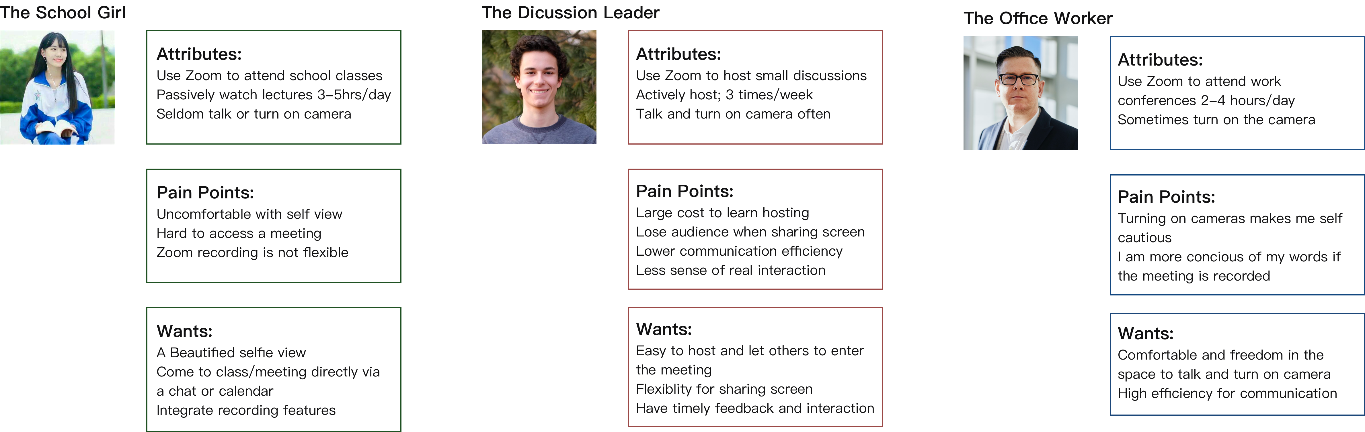
User Research: Interview
5 people, age 19-31, semi-structured
Key notes:
User Persona
Problem Statement
How might we reduce Zoom fatigue?
Concepts


UX Design
User’s flow

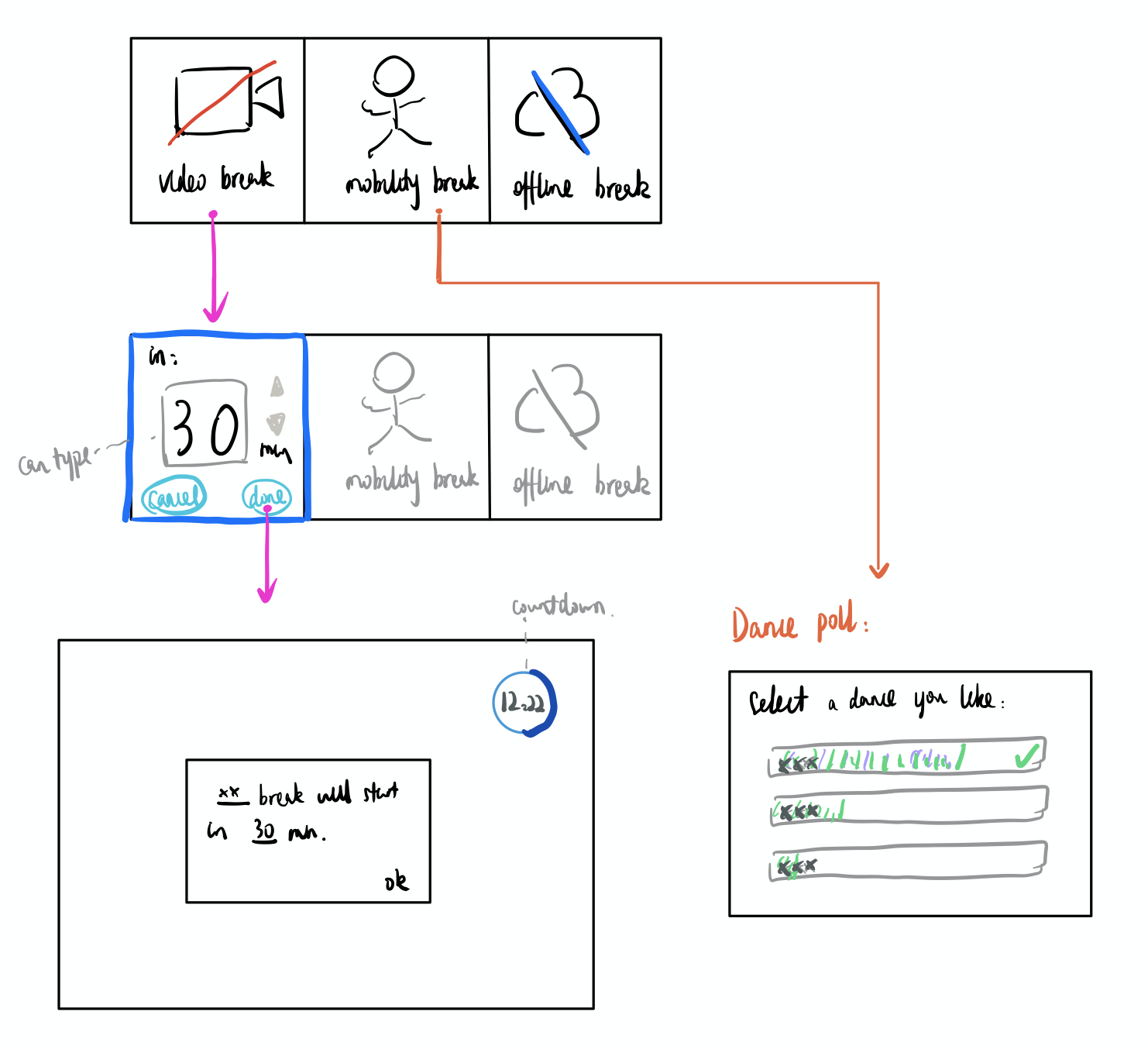
Wireframes 1.0: Added a "break" icon


Introduction: Added a "break" icon. When you click the "coffee" button, three options of break popped up.
Users' feedback: the dance break idea interesting, as the other two breaks are simply turning off videos and microphone. Most of my users would like me to go further solely for the dance break.
Wireframes 2.0: Solely for dance breaks
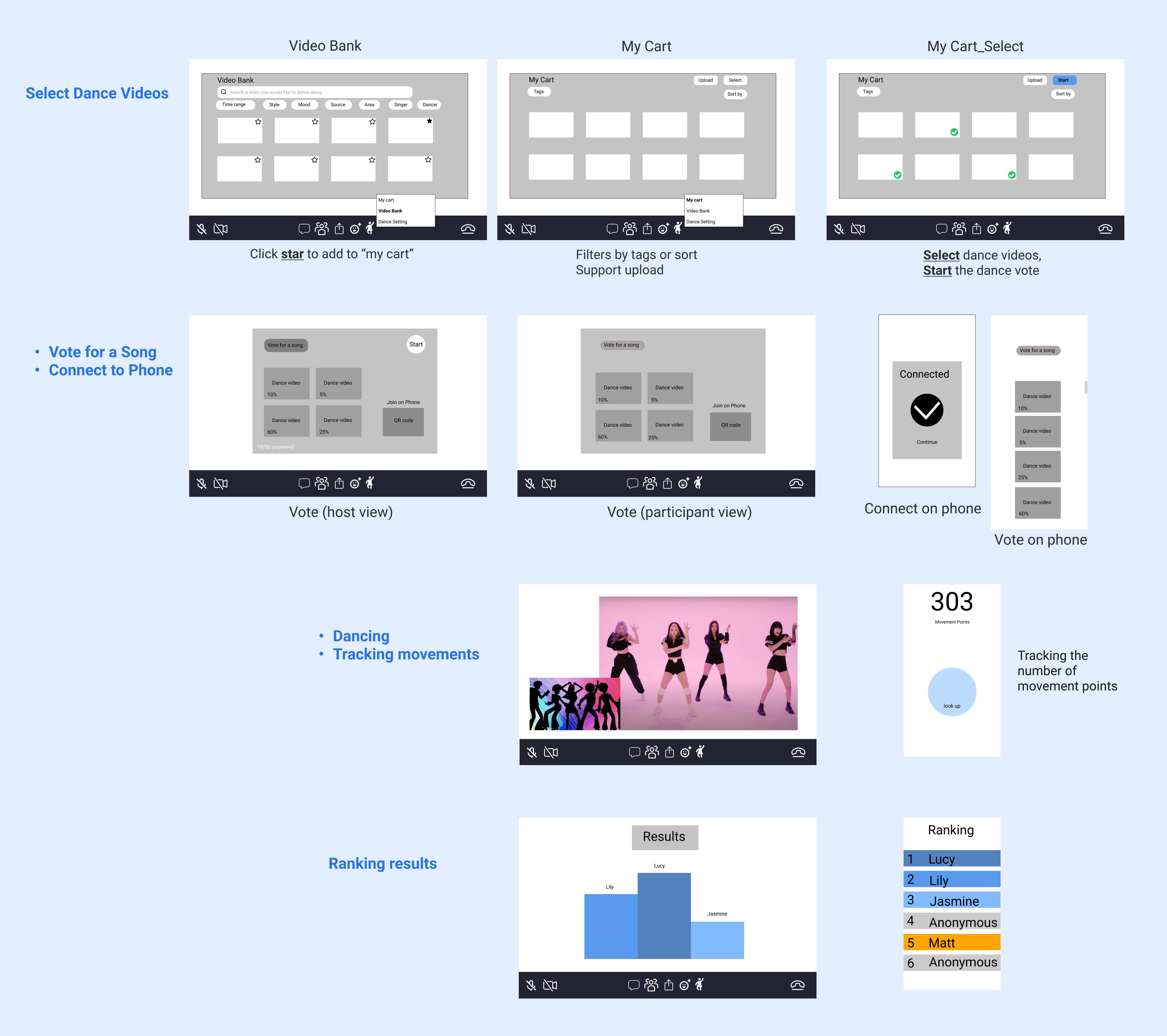
Introduction:
Users' feedback:
Wireframes 3.0: Simple and flexible happy path

With few steps to reduce fatigue, this is the happy path.
With users' satisfaction, I came to the UI design to make it polished.
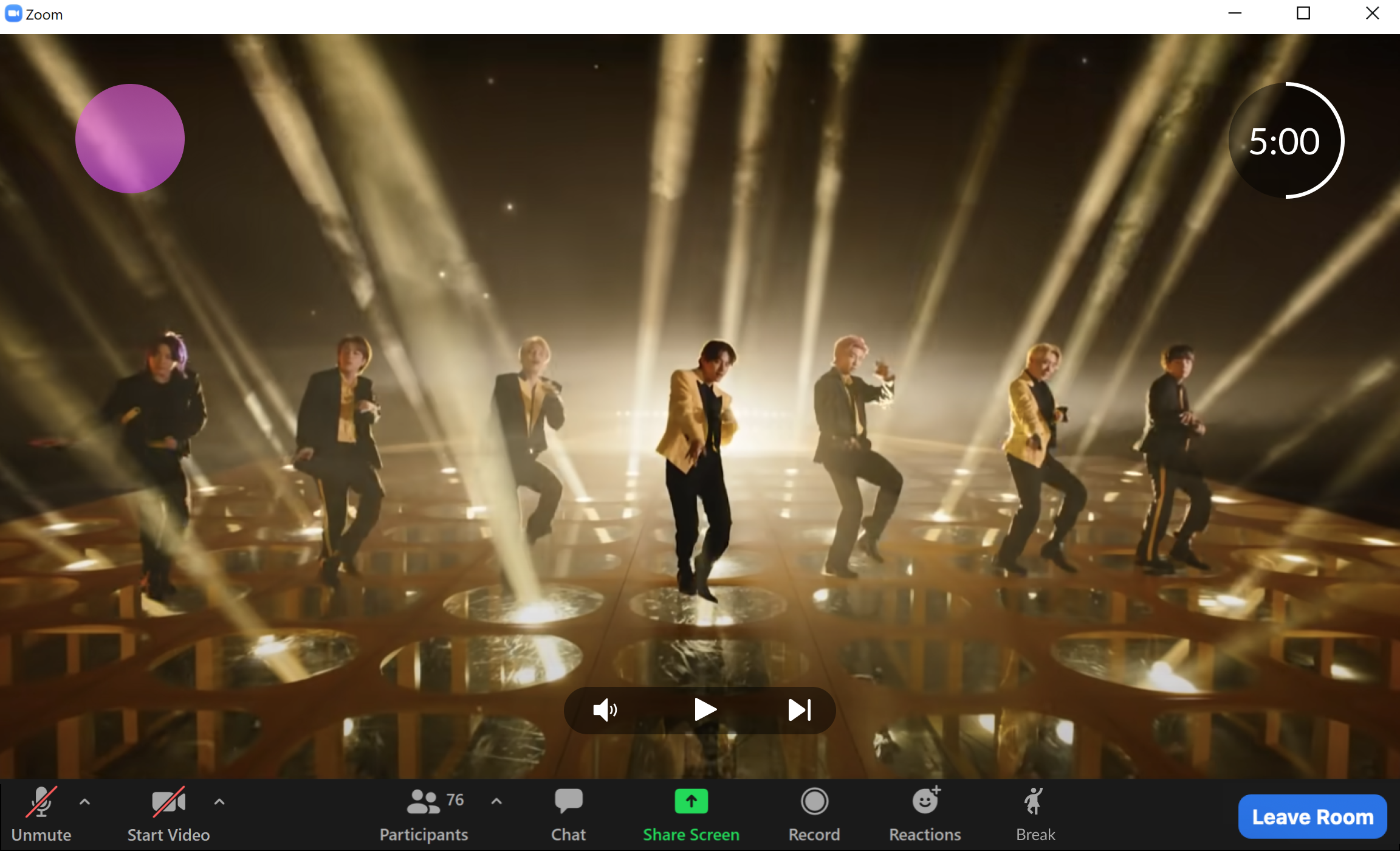
The biggest change is the wave in wireframes 3.0. To be better able seen by users and interact with the video, it should be an overlay cover the lower third of the video, just like karaoke music videos. However, it will be conflicted with the video tooltips. It means to be visualization of movements, and other solutions include: wave levels in Siri, move bar in Apple fitness, ossiscope and gauge on machines, etc. It can also be a pose which becomes big or small along with movements. Finally, I designed it as a colorful bubble whose color changes along with the users engagement. The bubble indicates their movements in a intriguing way. It is an overlay upon the video; and it is across from the time bubble, which is symmetry and easy to be seen by users.
Reflection and Next Steps
I am glad that finally I am able to find a happy path for users and hopefully reduce their Zoom fatigue. However, the sceneries along the journey are most beautiful, which are design thinking and problem solving. During my design journey, I modified several times of my design blueprints. I learned that stuck happens and there are many ways to access to a problem. I also need to enhance my crafts and gather richer toolbox of things to better able solve problems. In my presentation for ideation, I learned that I should present my decision and reasons instead of everything I have ever designed and thought. During my connection with users, I learned that I ought to let them engage in the conversation and the solution sought process. They are the entrance of problems, but also the exit.
For the next steps, I would do more user research and keep design iteration. I could also think of more forms of break rooms and the design of each of them. I would aim to make the "break" feature more mature and developed.